Plot selection User Interface
At the top of this page Plot selection User Interface is located. You can select the various data to plot different ways. Plot selection User Interface is controlled by dropdown menus, textboxes and checkboxes.
There are several Plot Types you can select from, that option determines how the data will be displayed.
You can change the Area to Common Area 1 or Common Area 2.
There are two Score Types: Continuous and Dichotomic.
For every plot you can change the Variable to display (and Threshold for Dichotomic scores), Index (the score you would like to see).
For some Plot Types you will be able to select different Lead time, Model, Year, Season.
You can set the plot axis/colorbar maximum and minimum values by Scale low and Scale high.
You can view heatmaps in 3D using the 3D view checkbox.
You can toggle heatmap Annotations. You can hide the Title, Legend/Colorscale.
As some of the scores (Fine resolution) are calculated only until 24 hour lead time, you can toggle 24 hour limit view for consistency with other scores.
If you want to use the plot in report/presentation or if the text is too small, you may consider using the Large font option.
Interactive Plot Control
You can control the interactive plot to get a better view on the data you are interested in and to hide the data you want to exclude.
When your mouse cursor is above the plot, Plot Menu appears at the top right corner containing several options and commands.
You can save the plot as PNG image by clicking on the Download plot as a png button in the Plot Menu.
You can show/hide the model data by clicking on it in a legend with mouse button. You can show only one model by double clicking on it.
You can move the plot by dragging it with left mouse button if the option Pan is selected (default).
You can zoom the plot using mouse scroll while the cursor is in the plot area, using the Zoom option and defining the view rectangle with left mouse button, using the Zoom in and Zoom out options. You can reset the zoom by using the Autoscale and Reset axes options.
You can scale axis using mouse scroll while the cursor is located over it.
You can Toggle Spike Lines (the lines from the point on which mouse cursor is located toward the axes).
You can either Show closest data on hover or Compare data on hover.
In 3D view mode you can rotate the surface using left mouse button. You can move the camera using right mouse button. You can select either Orbital rotation or Turntable rotation (default). You can reset the camera with Reset camera to last save option.
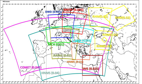
Area
Common Area 1: Coarse resolution
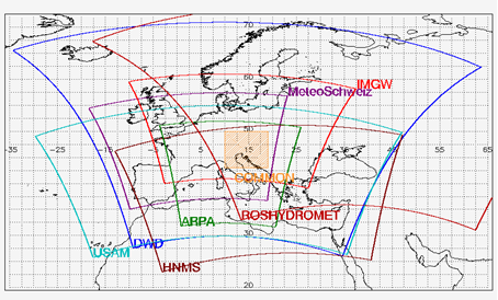
Common Area 2: Fine resolution
Scores
Continuous Scores
Mean error (ME):
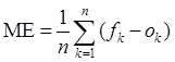
ME = 0 → perfect forecast
ME > 0 → systematic overestimation
ME < 0 → systematic underestimation
Root Mean Squared Error (RMSE):
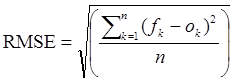
The smaller the RMSE the better the forecast
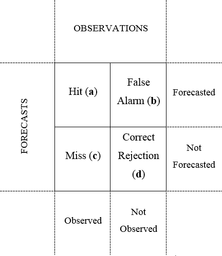
Dichotomy Scores based on Contingency table
Frequency Bias Index (FBI):
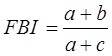
FBI = 1 → perfect forecast
FBI > 1 → over-forecasting
FBI < 1 → under-forecasting
Thread Score (TS):
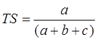
TS = 1 → perfect score
TS range: 0 to 1, 0 indicates no skill
Equitable Threat score (ETS):
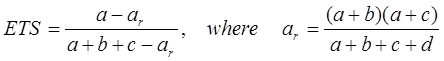
ETS = 1 → perfect score
ETS range: -1/3 to 1, 0 indicates no skill
True Skill Statistic (TSS):
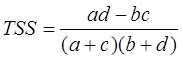
TSS = 1 → perfect score
TSS range: -1 to 1, 0 indicates no skill
Probability of Detection (POD):
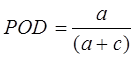
POD = 1 → perfect score
POD range: 0 to 1, 0 indicates no skill
False Alarm Ratio (FAR):
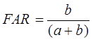
FAR = 0 → perfect score
FAR range: 0 to 1, 1 indicates no skill
Extremal Dependence Indices
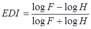
Extremal Dependence Index (EDI):
 ,
,
where hit rate (H):
 ,
,
and false-alarm rate (F):
 .
.
EDI = 1 → perfect score
EDI range: 0 to 1, 0 indicates no skill
Symmetric Extremal Dependence Index (SEDI):
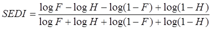
SEDI = 1 → perfect score
SEDI range: 0 to 1, 0 indicates no skill
Performance Diagram:
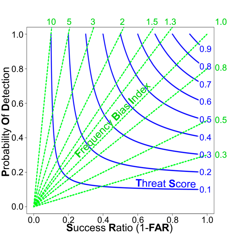
Performance diagram summarizes the Success Ratio (SR, that is FAR-1), POD, FBI, and TS.